DataTable2#
Enhanced data table for Flet that adds sticky headers, fixed rows/columns, and other UX improvements via the flet-datatable2 extension.
It wraps the Flutter data_table_2 package.
Platform Support#
| Platform | Windows | macOS | Linux | iOS | Android | Web |
|---|---|---|---|---|---|---|
| Supported | ✅ | ✅ | ✅ | ✅ | ✅ | ✅ |
Usage#
Add flet-datatable2 to your project dependencies:
Example#
import flet_datatable2 as fdt

import flet as ft


def main(page: ft.Page):
    page.add(
        fdt.DataTable2(
            empty=ft.Text("This table is empty."),
            columns=[
                fdt.DataColumn2(label=ft.Text("First name")),
                fdt.DataColumn2(label=ft.Text("Last name")),
                fdt.DataColumn2(label=ft.Text("Age"), numeric=True),
            ],
        ),
    )


ft.run(main)
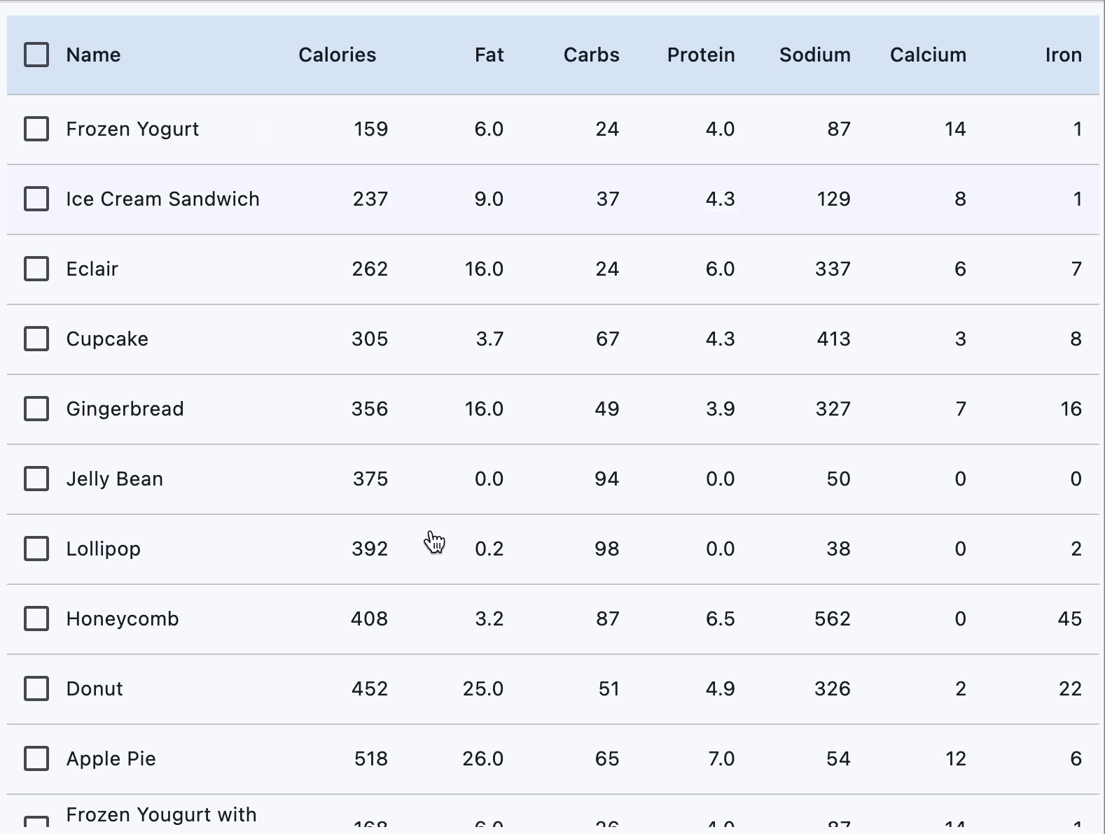
import flet_datatable2 as ftd
from data import desserts

import flet as ft


def main(page: ft.Page):
    page.vertical_alignment = ft.MainAxisAlignment.CENTER
    page.horizontal_alignment = ft.CrossAxisAlignment.CENTER

    def handle_row_selection_change(e: ft.Event[ftd.DataRow2]):
        e.control.selected = not e.control.selected
        e.control.update()

    def sort_column(e: ft.DataColumnSortEvent):
        print(f"Sorting column {e.column_index}, ascending={e.ascending}")

    def get_data_columns():
        data_columns = [
            ftd.DataColumn2(
                label=ft.Text("Name"),
                size=ftd.DataColumnSize.L,
                on_sort=sort_column,
                heading_row_alignment=ft.MainAxisAlignment.START,
            ),
            ftd.DataColumn2(
                label=ft.Text("Calories"),
                on_sort=sort_column,
                numeric=True,
                heading_row_alignment=ft.MainAxisAlignment.END,
            ),
            ftd.DataColumn2(
                label=ft.Text("Fat"),
                on_sort=sort_column,
                numeric=True,
            ),
            ftd.DataColumn2(
                label=ft.Text("Carbs"),
                on_sort=sort_column,
                numeric=True,
            ),
            ftd.DataColumn2(
                label=ft.Text("Protein"),
                on_sort=sort_column,
                numeric=True,
            ),
            ftd.DataColumn2(
                label=ft.Text("Sodium"),
                on_sort=sort_column,
                numeric=True,
            ),
            ftd.DataColumn2(
                label=ft.Text("Calcium"),
                on_sort=sort_column,
                numeric=True,
            ),
            ftd.DataColumn2(
                label=ft.Text("Iron"),
                on_sort=sort_column,
                numeric=True,
            ),
        ]
        return data_columns

    def get_data_rows(desserts):
        data_rows = []
        for dessert in desserts:
            data_rows.append(
                ftd.DataRow2(
                    specific_row_height=50,
                    on_select_change=handle_row_selection_change,
                    cells=[
                        ft.DataCell(content=ft.Text(dessert.name)),
                        ft.DataCell(content=ft.Text(dessert.calories)),
                        ft.DataCell(content=ft.Text(dessert.fat)),
                        ft.DataCell(content=ft.Text(dessert.carbs)),
                        ft.DataCell(content=ft.Text(dessert.protein)),
                        ft.DataCell(content=ft.Text(dessert.sodium)),
                        ft.DataCell(content=ft.Text(dessert.calcium)),
                        ft.DataCell(content=ft.Text(dessert.iron)),
                    ],
                )
            )
        return data_rows

    page.add(
        ftd.DataTable2(
            show_checkbox_column=True,
            expand=True,
            column_spacing=0,
            heading_row_color=ft.Colors.SECONDARY_CONTAINER,
            horizontal_margin=12,
            sort_ascending=True,
            bottom_margin=10,
            min_width=600,
            on_select_all=lambda e: print("All selected"),
            columns=get_data_columns(),
            rows=get_data_rows(desserts),
        ),
    )


ft.run(main)
Description#
Inherits: DataTable
Provides sticky header row, scrollable data rows,
and additional layout flexibility with DataColumn2
and DataRow2.
Note
DataTable2 doesn't support
DataTable.data_row_min_height
and DataTable.data_row_max_height
properties present in the parent DataTable.
Use data_row_height instead.
Properties
-
bottom_margin(Number | None) –Adds space after the last row if set.
-
checkbox_alignment(Alignment) –Alignment of the checkbox.
-
columns(list[DataColumn2 | DataColumn]) –A list of table columns.
-
data_row_checkbox_theme(CheckboxTheme | None) –Overrides theme of checkboxes in each data row.
-
data_row_height(Number | None) –Height of each data row.
-
data_row_max_height(None) – -
data_row_min_height(None) – -
empty(Control | None) –Placeholder control shown when there are no data rows.
-
fixed_columns_color(ColorValue | None) –Background color for sticky left columns.
-
fixed_corner_color(ColorValue | None) –Background color of the fixed top-left corner cell.
-
fixed_left_columns(int) –Number of sticky columns on the left. Includes checkbox column, if present.
-
fixed_top_rows(int) –Number of sticky rows from the top. Includes heading row by default.
-
heading_checkbox_theme(CheckboxTheme | None) –Overrides theme of the heading checkbox.
-
lm_ratio(Number) –Ratio of Large column width to Medium.
-
min_width(Number | None) –Minimum table width before horizontal scrolling kicks in.
-
rows(list[DataRow | DataRow2]) –A list of table rows.
-
show_heading_checkbox(bool) –Controls visibility of the heading checkbox.
-
sm_ratio(Number) –Ratio of Small column width to Medium.
-
sort_arrow_animation_duration(DurationValue) –Duration of sort arrow animation.
-
sort_arrow_icon(IconData) –Icon shown when sorting is applied.
-
sort_arrow_icon_color(ColorValue | None) –When set always overrides/preceeds default arrow icon color.
-
visible_horizontal_scroll_bar(bool | None) –Determines visibility of the horizontal scrollbar.
-
visible_vertical_scroll_bar(bool | None) –Determines visibility of the vertical scrollbar.
Properties#
Alignment of the checkbox.
data_row_checkbox_theme: CheckboxTheme | None = None
Overrides theme of checkboxes in each data row.
data_row_max_height: None = field(
    init=False,
    repr=False,
    compare=False,
    metadata={"skip": True},
)
data_row_min_height: None = field(
    init=False,
    repr=False,
    compare=False,
    metadata={"skip": True},
)
fixed_columns_color: ColorValue | None = None
Background color for sticky left columns.
fixed_corner_color: ColorValue | None = None
Background color of the fixed top-left corner cell.
fixed_left_columns: int = 0
Number of sticky columns on the left. Includes checkbox column, if present.
fixed_top_rows: int = 1
Number of sticky rows from the top. Includes heading row by default.
heading_checkbox_theme: CheckboxTheme | None = None
Overrides theme of the heading checkbox.
min_width: Number | None = None
Minimum table width before horizontal scrolling kicks in.
show_heading_checkbox: bool = True
Controls visibility of the heading checkbox.
sort_arrow_animation_duration: DurationValue = field(
    default_factory=lambda: Duration(milliseconds=150)
)
Duration of sort arrow animation.
sort_arrow_icon_color: ColorValue | None = None
When set always overrides/preceeds default arrow icon color.