Icon
A control that displays an icon from a built-in or custom icon set.
Icons can be customized in color, size, and visual style using various parameters such as stroke weight, fill level, and shadows.
Inherits: LayoutControl
Properties
-
apply_text_scaling(bool | None) –Whether to scale the icon based on the system or user's preferred text size.
-
blend_mode(BlendMode | None) –The blend mode used when rendering the icon.
-
color(ColorValue | None) –The color to use when drawing the icon.
-
fill(Number | None) –The fill amount of the icon, between
0.0(outline) and1.0(solid). -
grade(Number | None) –A fine-tuning adjustment for the stroke thickness of the icon.
-
icon(IconData) –The icon to display, selected from a predefined icon set.
-
optical_size(Number | None) –Adjusts the icon's visual style for different sizes to maintain clarity and balance.
-
semantics_label(str | None) –An accessibility label for the icon.
-
shadows(BoxShadowValue | None) –A list of shadows to apply beneath the icon.
-
size(Number | None) –The size (width and height) of the square area the icon will occupy.
-
weight(Number | None) –The stroke weight (thickness) of the icon's lines.
Examples#
To browse and visualize all available icons, visit our icons browser
Basic Example#
from typing import cast
import flet as ft
def main(page: ft.Page):
page.add(
# material
ft.Row(
controls=[
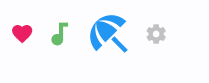
ft.Icon(ft.Icons.FAVORITE, color=ft.Colors.PINK),
ft.Icon(ft.Icons.AUDIOTRACK, color=ft.Colors.GREEN_400, size=30),
ft.Icon(ft.Icons.BEACH_ACCESS, color=ft.Colors.BLUE, size=50),
ft.Icon(ft.Icons.SETTINGS, color="#c1c1c1"),
]
),
# cupertino
ft.Row(
controls=[
ft.Icon(ft.CupertinoIcons.PROFILE_CIRCLED, color=ft.Colors.PINK),
ft.Icon(
icon=cast(ft.CupertinoIcons, ft.CupertinoIcons.random()),
color=ft.Colors.GREEN_400,
size=30,
),
ft.Icon(
icon=cast(ft.CupertinoIcons, ft.CupertinoIcons.random()),
color=ft.Colors.BLUE,
size=50,
),
ft.Icon(
icon=cast(ft.CupertinoIcons, ft.CupertinoIcons.random()),
color="#c1c1c1",
),
]
),
)
if __name__ == "__main__":
ft.run(main)
Properties#
apply_text_scaling: bool | None = None
Whether to scale the icon based on the system or user's preferred text size.
Useful when placing icons alongside text, ensuring both scale consistently for better readability and accessibility.
The blend mode used when rendering the icon.
Blend modes control how the icon's color interacts with the background.
The default is normal blending (SRC_OVER).
fill: Number | None = None
The fill amount of the icon, between 0.0 (outline) and 1.0 (solid).
This feature requires the icon's font to support fill variation. It can be used to indicate state transitions or selection visually.
Raises:
-
ValueError–If
fillis less than0.0or greater than1.0.
grade: Number | None = None
A fine-tuning adjustment for the stroke thickness of the icon.
This requires support from the icon's font. Grade values can be negative or positive. It allows precise visual adjustments without changing icon size.
icon: IconData
The icon to display, selected from a predefined icon set.
You can explore available icons using the Flet Icons Browser.
optical_size: Number | None = None
Adjusts the icon's visual style for different sizes to maintain clarity and balance.
This requires the icon font to support optical sizing.
Must be greater than 0.
Raises:
-
ValueError–If
optical_sizeis less than or equal to0.0.
semantics_label: str | None = None
An accessibility label for the icon.
This text is not displayed visually but may be announced by screen readers or other assistive technologies.
shadows: BoxShadowValue | None = None
A list of shadows to apply beneath the icon.
Use multiple shadows to simulate complex lighting effects. The order of shadows matters for how transparency is blended.
size: Number | None = None
The size (width and height) of the square area the icon will occupy.
If not set, a default size will be used. When placing this icon inside other controls (such as buttons), those controls may also affect sizing.
weight: Number | None = None
The stroke weight (thickness) of the icon's lines.
This requires the icon font to support weight variation.
Must be greater than 0.
Raises:
-
ValueError–If
weightis less than or equal to0.0.