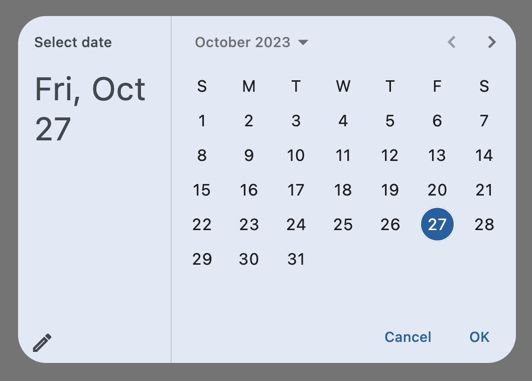
DatePicker
A Material-style date picker dialog.
It can be opened by calling Page.show_dialog() method.
Depending on the date_picker_entry_mode, it will show either a Calendar
or an Input (TextField) for picking a date.
Inherits: DialogControl
Properties
-
barrier_color(ColorValue | None) –The color of the modal barrier that
-
cancel_text(str | None) –The text that is displayed on the cancel button. Defaults to
"Cancel". -
confirm_text(str | None) –The text that is displayed on the confirm button. Defaults to
"OK". -
current_date(DateTimeValue) –The date representing today. It will be highlighted in the day grid.
-
date_picker_entry_mode(DatePickerEntryMode) –The initial mode of date entry method for the date picker dialog.
-
date_picker_mode(DatePickerMode) –Initial display of a calendar date picker.
-
error_format_text(str | None) –The error message displayed below the TextField if the entered date is not in the
-
error_invalid_text(str | None) –The error message displayed below the TextField if the date is earlier than
-
field_hint_text(str | None) –The hint text displayed in the text field.
-
field_label_text(str | None) –The label text displayed in the TextField.
-
first_date(DateTimeValue) –The earliest allowable date that the user can select. Defaults to
January 1, 1900. -
help_text(str | None) –The text that is displayed at the top of the header.
-
keyboard_type(KeyboardType) –The type of keyboard to use for editing the text.
-
last_date(DateTimeValue) –The latest allowable date that the user can select. Defaults to
January 1, 2050. -
modal(bool) –Whether this date picker cannot be dismissed by clicking the area outside of it.
-
switch_to_calendar_icon(IconData | None) –The name of the icon displayed in the corner of the dialog when
-
switch_to_input_icon(IconData | None) –The name of the icon displayed in the corner of the dialog when
-
value(DateTimeValue | None) –The selected date that the picker should display.
Events
-
on_change(ControlEventHandler[DatePicker] | None) –Called when user clicks confirm button.
-
on_entry_mode_change(EventHandler[DatePickerEntryModeChangeEvent] | None) –Called when the
date_picker_entry_mode
Examples#
Basic Example#
import datetime

import flet as ft


def main(page: ft.Page):
    page.horizontal_alignment = ft.CrossAxisAlignment.CENTER

    def handle_change(e: ft.Event[ft.DatePicker]):
        page.add(ft.Text(f"Date changed: {e.control.value.strftime('%m/%d/%Y')}"))

    def handle_dismissal(e: ft.Event[ft.DatePicker]):
        page.add(ft.Text("DatePicker dismissed"))

    page.add(
        ft.Button(
            content="Pick date",
            icon=ft.Icons.CALENDAR_MONTH,
            on_click=lambda e: page.show_dialog(
                ft.DatePicker(
                    first_date=datetime.datetime(year=2000, month=10, day=1),
                    last_date=datetime.datetime(year=2025, month=10, day=1),
                    on_change=handle_change,
                    on_dismiss=handle_dismissal,
                )
            ),
        )
    )


ft.run(main)
Properties#
barrier_color: ColorValue | None = None
The color of the modal barrier that darkens everything below the date picker.
If None, the DialogTheme.barrier_color
is used.
If it is also None, then Colors.BLACK_54 is used.
cancel_text: str | None = None
The text that is displayed on the cancel button. Defaults to "Cancel".
confirm_text: str | None = None
The text that is displayed on the confirm button. Defaults to "OK".
current_date: DateTimeValue = field(
    default_factory=lambda: now()
)
The date representing today. It will be highlighted in the day grid.
date_picker_entry_mode: DatePickerEntryMode = CALENDAR
The initial mode of date entry method for the date picker dialog.
date_picker_mode: DatePickerMode = DAY
Initial display of a calendar date picker.
error_format_text: str | None = None
The error message displayed below the TextField if the entered date is not in the correct format.
Defaults to "Invalid format".
error_invalid_text: str | None = None
The error message displayed below the TextField if the date is earlier than
first_date or later than last_date.
Defaults to "Out of range".
field_hint_text: str | None = None
The hint text displayed in the text field.
The default value is the date format string that depends on your locale. For example, 'mm/dd/yyyy' for en_US.
field_label_text: str | None = None
The label text displayed in the TextField.
Defaults to "Enter Date".
first_date: DateTimeValue = field(
    default_factory=lambda: datetime(
        year=1900, month=1, day=1
    )
)
The earliest allowable date that the user can select. Defaults to January 1, 1900.
help_text: str | None = None
The text that is displayed at the top of the header.
This is used to indicate to the user what they are selecting a date for.
Defaults to "Select date".
keyboard_type: KeyboardType = DATETIME
The type of keyboard to use for editing the text.
last_date: DateTimeValue = field(
    default_factory=lambda: datetime(
        year=2050, month=1, day=1
    )
)
The latest allowable date that the user can select. Defaults to January 1, 2050.
modal: bool = False
Whether this date picker cannot be dismissed by clicking the area outside of it.
switch_to_calendar_icon: IconData | None = None
The name of the icon displayed in the corner of the dialog when
date_picker_entry_mode
is DatePickerEntryMode.INPUT.
Clicking on this icon changes the date_picker_entry_mode to
DatePickerEntryMode.CALENDAR.
If None, Icons.CALENDAR_TODAY is used.
switch_to_input_icon: IconData | None = None
The name of the icon displayed in the corner of the dialog when
date_picker_entry_mode
is DatePickerEntryMode.CALENDAR.
Clicking on icon changes the DatePickerEntryMode to
DatePickerEntryMode.INPUT.
If None, Icons.EDIT_OUTLINED is used.
value: DateTimeValue | None = None
The selected date that the picker should display.
Defaults to current_date.
Events#
on_change: ControlEventHandler[DatePicker] | None = None
Called when user clicks confirm button.
value is updated with selected date.
The data property of the event handler argument contains the selected date.
on_entry_mode_change: (
    EventHandler[DatePickerEntryModeChangeEvent] | None
) = None
Called when the date_picker_entry_mode
is changed.