CupertinoSwitch
Inherits: LayoutControl
Properties
-
active_thumb_image(str | None) –An image to use on the thumb of this switch when the switch is on.
-
active_track_color(ColorValue | None) –The color to use on the track when this switch is on.
-
autofocus(bool) –Whether this switch will be selected as the initial focus.
-
focus_color(ColorValue | None) –The color to use for the focus highlight for keyboard interactions.
-
inactive_thumb_color(ColorValue | None) –The color to use on the thumb when this switch is off.
-
inactive_thumb_image(str | None) –An image to use on the thumb of this switch when the switch is off.
-
inactive_track_color(ColorValue | None) –The color to use on the track when this switch is off.
-
label(str | None) –The clickable label to display on the right of this switch.
-
label_position(LabelPosition) –The position of the
labelrelative to this switch. -
off_label_color(ColorValue | None) –The color to use for the accessibility label when the switch is off.
-
thumb_color(ColorValue | None) –The color of this switch's thumb.
-
thumb_icon(ControlStateValue[IconData] | None) –The icon of this Switch's thumb in various
-
track_outline_color(ControlStateValue[ColorValue] | None) –The outline color of this switch's track
-
track_outline_width(ControlStateValue[Number | None] | None) –The outline width of this switch's track in all or specific
-
value(bool) –The current value of this switch.
Events
-
on_blur(ControlEventHandler[CupertinoSwitch] | None) –Called when this switch has lost focus.
-
on_change(ControlEventHandler[CupertinoSwitch] | None) –Called when the state of this switch is changed.
-
on_focus(ControlEventHandler[CupertinoSwitch] | None) –Called when this switch has received focus.
-
on_image_error(ControlEventHandler[CupertinoSwitch] | None) –Called when
active_thumb_imageor -
on_label_color(ColorValue | None) –The color to use for the accessibility label when the switch is on.
Examples#
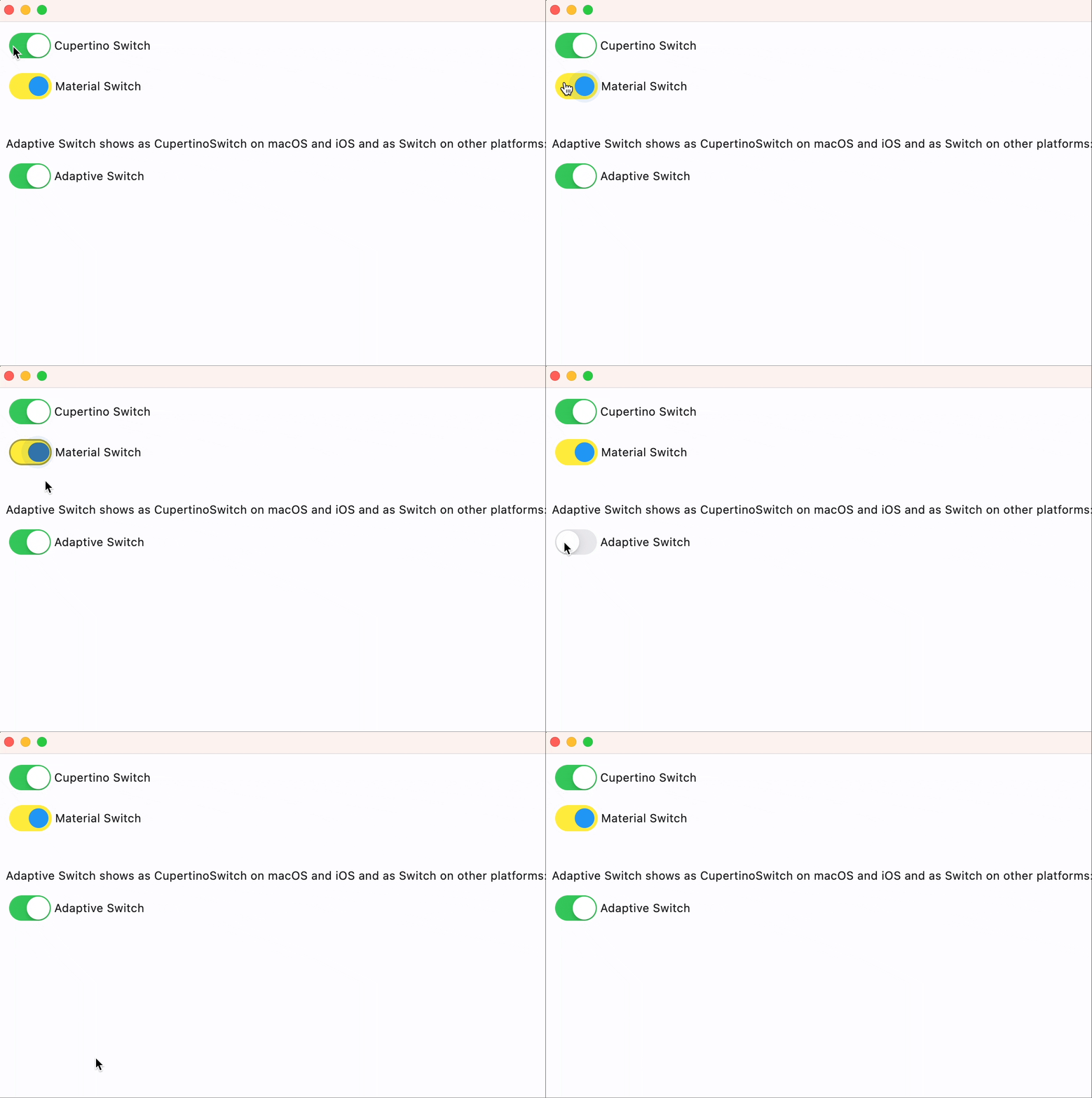
Cupertino, Material and Adaptive Switches#
import flet as ft


def main(page: ft.Page):
    page.add(
        ft.CupertinoSwitch(
            label="Cupertino Switch",
            value=True,
        ),
        ft.Switch(
            label="Material Switch",
            value=True,
            thumb_color={ft.ControlState.SELECTED: ft.Colors.BLUE},
            track_color=ft.Colors.YELLOW,
            focus_color=ft.Colors.PURPLE,
        ),
        ft.Container(height=20),
        ft.Text(
            value="Adaptive Switch shows as CupertinoSwitch on macOS and iOS and as Switch on other platforms:"
        ),
        ft.Switch(
            adaptive=True,
            label="Adaptive Switch",
            value=True,
        ),
    )


ft.run(main)
Properties#
active_thumb_image: str | None = None
An image to use on the thumb of this switch when the switch is on.
Can be a local file path or URL.
active_track_color: ColorValue | None = None
The color to use on the track when this switch is on.
autofocus: bool = False
Whether this switch will be selected as the initial focus.
If there is more than one control on a page with autofocus set, then the first one added to the page will get focus.
focus_color: ColorValue | None = None
The color to use for the focus highlight for keyboard interactions.
inactive_thumb_color: ColorValue | None = None
The color to use on the thumb when this switch is off.
If None, defaults to thumb_color, and if this is also None,
defaults to CupertinoColors.WHITE.
inactive_thumb_image: str | None = None
An image to use on the thumb of this switch when the switch is off.
Can be a local file path or URL.
inactive_track_color: ColorValue | None = None
The color to use on the track when this switch is off.
label_position: LabelPosition = RIGHT
The position of the label relative to this switch.
off_label_color: ColorValue | None = None
The color to use for the accessibility label when the switch is off.
thumb_icon: ControlStateValue[IconData] | None = None
The icon of this Switch's thumb in various
ControlStates.
Supported states: ControlState.SELECTED,
ControlState.HOVERED, ControlState.DISABLED,
ControlState.FOCUSED, and ControlState.DEFAULT.
track_outline_color: (
    ControlStateValue[ColorValue] | None
) = None
The outline color of this switch's track
in various ControlStates.
Supported states: ControlState.SELECTED,
ControlState.HOVERED, ControlState.DISABLED,
ControlState.FOCUSED, and ControlState.DEFAULT.
track_outline_width: (
    ControlStateValue[Number | None] | None
) = None
The outline width of this switch's track in all or specific
ControlStates.
Supported states: ControlState.SELECTED,
ControlState.HOVERED, ControlState.DISABLED,
ControlState.FOCUSED, and ControlState.DEFAULT.
Events#
on_blur: ControlEventHandler[CupertinoSwitch] | None = None
Called when this switch has lost focus.
on_change: ControlEventHandler[CupertinoSwitch] | None = (
    None
)
Called when the state of this switch is changed.
on_focus: ControlEventHandler[CupertinoSwitch] | None = None
Called when this switch has received focus.
on_image_error: (
    ControlEventHandler[CupertinoSwitch] | None
) = None
Called when active_thumb_image or
inactive_thumb_image fails to load.
on_label_color: ColorValue | None = None
The color to use for the accessibility label when the switch is on.
