Button
Enabled and disabled buttons
Inherits: LayoutControl, AdaptiveControl
Properties
-
autofocus(bool | None) –Whether this button should be focused initially.
-
bgcolor(ColorValue | None) –The button's background color.
-
clip_behavior(ClipBehavior | None) –The button's clip behavior.
-
color(ColorValue | None) –The button's foreground color.
-
content(StrOrControl | None) –The button's label.
-
elevation(Number) –The button's elevation.
-
icon(IconDataOrControl | None) –The icon to display inside the button.
-
icon_color(ColorValue | None) –The color of the icon.
-
style(ButtonStyle | None) –The button's style.
-
url(str | Url | None) –The URL to open when the button is clicked.
Events
-
on_blur(ControlEventHandler[Button] | None) –Called when the button loses focus.
-
on_click(ControlEventHandler[Button] | None) –Called when the button is clicked.
-
on_focus(ControlEventHandler[Button] | None) –Called when the button is focused.
-
on_hover(ControlEventHandler[Button] | None) –Called when the button is hovered.
-
on_long_press(ControlEventHandler[Button] | None) –Called when the button is long-pressed.
Methods
-
focus–Focus the button.
Examples#
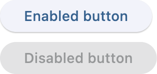
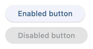
Button#
import flet as ft


def main(page: ft.Page):
    page.add(
        ft.Button(content="Enabled button"),
        ft.Button(content="Disabled button", disabled=True),
    )


if __name__ == "__main__":
    ft.run(main)
Icons#
import flet as ft


def main(page: ft.Page):
    page.add(
        ft.Button(content="Button with icon", icon=ft.Icons.WAVES_ROUNDED),
        ft.Button(
            content="Button with colorful icon",
            icon=ft.Icons.PARK_ROUNDED,
            icon_color=ft.Colors.GREEN_400,
        ),
    )


if __name__ == "__main__":
    ft.run(main)
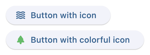
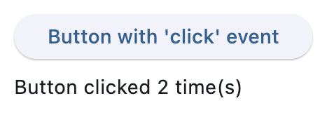
Handling clicks#
import flet as ft


def main(page: ft.Page):
    def button_clicked(e: ft.Event[ft.Button]):
        button.data += 1
        message.value = f"Button clicked {button.data} time(s)"
        page.update()

    page.add(
        button := ft.Button(
            content="Button with 'click' event",
            data=0,
            on_click=button_clicked,
        ),
        message := ft.Text(),
    )


if __name__ == "__main__":
    ft.run(main)
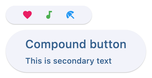
Custom content#
import flet as ft


def main(page: ft.Page):
    page.add(
        ft.Button(
            width=150,
            content=ft.Row(
                alignment=ft.MainAxisAlignment.SPACE_AROUND,
                controls=[
                    ft.Icon(ft.Icons.FAVORITE, color=ft.Colors.PINK),
                    ft.Icon(ft.Icons.AUDIOTRACK, color=ft.Colors.GREEN),
                    ft.Icon(ft.Icons.BEACH_ACCESS, color=ft.Colors.BLUE),
                ],
            ),
        ),
        ft.Button(
            content=ft.Container(
                padding=ft.Padding.all(10),
                content=ft.Column(
                    alignment=ft.MainAxisAlignment.CENTER,
                    spacing=5,
                    controls=[
                        ft.Text(value="Compound button", size=20),
                        ft.Text(value="This is secondary text"),
                    ],
                ),
            ),
        ),
    )


if __name__ == "__main__":
    ft.run(main)
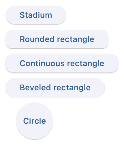
Shapes#
import flet as ft


def main(page: ft.Page):
    page.padding = 30
    page.spacing = 30

    page.add(
        ft.Button(
            content="Stadium",
            style=ft.ButtonStyle(shape=ft.StadiumBorder()),
        ),
        ft.Button(
            content="Rounded rectangle",
            style=ft.ButtonStyle(shape=ft.RoundedRectangleBorder(radius=10)),
        ),
        ft.Button(
            content="Continuous rectangle",
            style=ft.ButtonStyle(shape=ft.ContinuousRectangleBorder(radius=30)),
        ),
        ft.Button(
            content="Beveled rectangle",
            style=ft.ButtonStyle(shape=ft.BeveledRectangleBorder(radius=10)),
        ),
        ft.Button(
            content="Circle",
            style=ft.ButtonStyle(shape=ft.CircleBorder(), padding=30),
        ),
    )


if __name__ == "__main__":
    ft.run(main)
Styling#
import flet as ft


def main(page: ft.Page):
    page.add(
        ft.Button(
            content="Styled button 1",
            style=ft.ButtonStyle(
                color={
                    ft.ControlState.HOVERED: ft.Colors.WHITE,
                    ft.ControlState.FOCUSED: ft.Colors.BLUE,
                    ft.ControlState.DEFAULT: ft.Colors.BLACK,
                },
                bgcolor={
                    ft.ControlState.FOCUSED: ft.Colors.PINK_200,
                    ft.ControlState.DEFAULT: ft.Colors.YELLOW,
                },
                padding={ft.ControlState.HOVERED: 20},
                overlay_color=ft.Colors.TRANSPARENT,
                elevation={
                    ft.ControlState.DEFAULT: 0,
                    ft.ControlState.HOVERED: 5,
                    ft.ControlState.PRESSED: 10,
                },
                animation_duration=500,
                side={
                    ft.ControlState.DEFAULT: ft.BorderSide(1, color=ft.Colors.BLUE_100),
                    ft.ControlState.HOVERED: ft.BorderSide(3, color=ft.Colors.BLUE_400),
                    ft.ControlState.PRESSED: ft.BorderSide(6, color=ft.Colors.BLUE_600),
                },
                shape={
                    ft.ControlState.HOVERED: ft.RoundedRectangleBorder(radius=20),
                    ft.ControlState.DEFAULT: ft.RoundedRectangleBorder(radius=2),
                },
            ),
        )
    )


if __name__ == "__main__":
    ft.run(main)
Default state
Hovered state
Animate on hover#
import flet as ft


def main(page: ft.Page):
    def animate(e: ft.Event[ft.Button]):
        e.control.rotate = 0.1 if e.data else 0
        page.update()

    page.add(
        ft.Button(
            content="Hover over me, I'm animated!",
            rotate=0,
            animate_rotation=100,
            on_hover=animate,
            on_click=lambda e: page.add(ft.Text("Clicked! Try a long press!")),
            on_long_press=lambda e: page.add(ft.Text("I knew you could do it!")),
        )
    )


if __name__ == "__main__":
    ft.run(main)
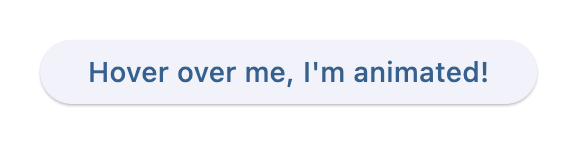
Normal button
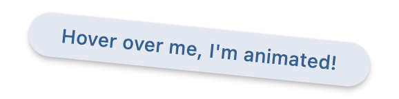
Hovered button
Properties#
bgcolor: ColorValue | None = field(
    default=None, metadata={"skip": True}
)
The button's background color. If not specified, defaults to the theme's primary color.
color: ColorValue | None = field(
    default=None, metadata={"skip": True}
)
The button's foreground color. If not specified, defaults to the theme's primary color.
content: StrOrControl | None = None
The button's elevation.
If not specified, defaults to 1.
icon: IconDataOrControl | None = None
icon_color: ColorValue | None = None
The color of the icon. If not specified, defaults to the current foreground color.
style: ButtonStyle | None = field(
    default=None, metadata={"skip": True}
)
The button's style.
Events#
on_long_press: ControlEventHandler[Button] | None = None
Called when the button is long-pressed.